Color is more than just a visual element—it’s a powerful psychological tool that shapes perceptions, evokes emotions, and influences behavior. In branding and design, color is often the first impression a consumer experiences, and it can make the difference between a brand being memorable or forgettable. Understanding the psychology of color allows businesses and designers to craft visual identities that resonate with their target audience and reinforce their messaging.
The Emotional Impact of Color
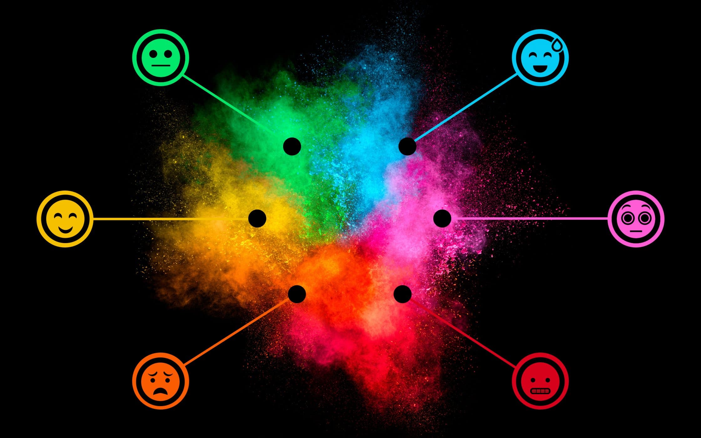
Colors are intrinsically linked to emotions. Red, for instance, is associated with energy, urgency, and passion. It can stimulate appetite, which is why many food brands, like McDonald’s and Coca-Cola, incorporate red into their logos. Blue, on the other hand, evokes feelings of trust, calm, and professionalism, making it a favorite among tech companies and financial institutions such as IBM and PayPal. Yellow communicates optimism and creativity, while green often represents growth, health, and sustainability. Each color carries cultural connotations as well, so designers must consider the target market’s background and preferences when selecting a color palette.
Color and Brand Identity
A brand’s color palette is a cornerstone of its identity. Consistent use of color across logos, websites, packaging, and marketing materials creates a cohesive visual language that strengthens brand recognition. Think of iconic brands like Nike with its black and white simplicity, or Tiffany & Co. with its signature robin’s-egg blue. The colors themselves become symbolic, instantly evoking the brand in consumers’ minds. This association isn’t accidental—careful color choices are rooted in an understanding of how specific hues influence perception and behavior.
Influencing Consumer Behavior
Color doesn’t just evoke emotions; it can also guide behavior. Studies show that color can increase brand recognition by up to 80%, influence purchasing decisions, and even affect perceptions of taste and quality. For example, a luxury brand might use deep purples or blacks to convey sophistication and exclusivity, while a children’s toy company might use bright, vibrant colors to communicate fun and excitement. By aligning color choices with brand values and the desired consumer response, businesses can subtly influence how their products and services are perceived.
The Role of Contrast and Combination

While individual colors carry meaning, combinations and contrasts are equally important. High-contrast color schemes can draw attention to key elements, such as call-to-action buttons or sale promotions. Complementary colors can create visual harmony, making designs more aesthetically pleasing and memorable. Designers must also consider accessibility—ensuring sufficient contrast for readability and inclusivity. The strategic pairing of colors can amplify emotional impact, reinforce messaging, and enhance the overall user experience.
Cultural Considerations
Color psychology is not universal. Cultural context significantly affects how colors are perceived. For instance, white is often associated with purity and weddings in Western cultures, but in some Eastern cultures, it represents mourning. Red symbolizes luck and prosperity in China, whereas in South Africa, it may signify mourning. Brands operating globally must adapt their color strategies to resonate appropriately with diverse audiences, avoiding unintended misinterpretations or negative associations.
Trends and Evolution
Color trends evolve over time, influenced by fashion, technology, and societal moods. While it’s essential for brands to stay contemporary, they should also prioritize timelessness in their core color identity. Many successful brands balance trend-driven accents with a consistent, recognizable color scheme that anchors their identity. Designers often use tools like Pantone’s Color of the Year to inspire fresh palettes while maintaining brand coherence.
Conclusion
The psychology of color is a subtle yet powerful force in branding and design. By understanding the emotional, behavioral, and cultural impacts of color, businesses can craft compelling visual identities that resonate with their audiences, reinforce messaging, and influence consumer behavior. Effective use of color is more than an aesthetic choice—it’s a strategic tool that communicates the essence of a brand without words. In a crowded marketplace, where first impressions are critical, color can be the decisive factor that makes a brand unforgettable.